LIFESTYLE
The American University of Beirut Reaffirms Identity with New Logo
Rita Khoueiry
1-September-2022


To celebrate its 157th academic year, the American University of Beirut (AUB), which main focus is on educational philosophy, standards, and practices on the American liberal arts model of higher education, unveiled its new and uplifted logo on August 31th, 2022.
According to Dr. Fadlo Khuri, AUB president, this logo version highlights their identity, “this fresh and distinctive new look reaffirms our identity as one of the oldest and most prestigious universities of the Global South, one that is firmly rooted in Beirut, yet with an increasingly robust global presence.”
Over the decades, the teaching-centered research university has gone through many changes, its logo included. The latter have been revamped 20 times since 1886; however, it has always maintained the same message. Despite all the changes—even changing the university’s very name in 1920—the American University of Beirut has always remained true to its enduring mission and its aspirational vision of realizing a better tomorrow for the people of Lebanon and beyond.
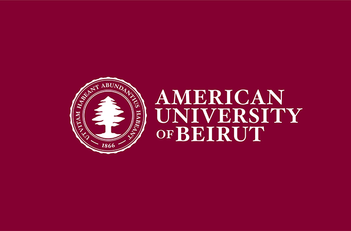
The new logo mirrors the university’s core identity, long history, and proud heritage, along with its rootedness in Beirut and its longstanding values. “The cedar tree with its proud and healthy roots reaffirms our commitment to AUB’s eternal home, while our motto ‘that they may have life and have it more abundantly’ in Latin is brought to the fore,” Dr. Khuri declared. “This is a vital element of our ethos as an institution, one that inspires hope and builds better futures for our own community and for the communities that we and our graduates serve,” he added.
Dr. Fadlo Khuri mentioned that there are many important reasons for this uplift at this particular time. He spoke about the new phase in the university’s bold trajectory, opening twin campuses outside of Beirut—the first in Pafos, Cyprus—in addition to expanding AUB’s global reach through strategic online offerings, a stronger presence in North America, in addition to other initiatives. “As we look to connect with new audiences outside our Beirut base, it is critical that our messaging is straightforward and our identity clear. In a world of acronyms, the words behind them can get lost or misunderstood, so spelling out the full name is more important than ever, although internally the ‘AUB’ we all know and love will continue to be used.”
Another noticeable change in the AUB visual identity is the red that is being referred to as Berytus Red, which is inspired by the distinctive brownish red soils of Lebanon and reminiscent of the red wax used with the American University of Beirut’s seal to mark official documents, including diplomas. In addition, a new Arabic typeface is being created to be far more agile and versatile than the calligraphy that had been used before. An additional important reason for the new logo is that it was specifically designed to be read clearly across all types of media, including social media.
“Despite all the changes, when you look back at the AUB logo through history, you will see that the new logo is not so much a departure as a fresh take on our historic identity,” Dr. Khuri added.
AUB president ended his message by saying : “the American University of Beirut is and will always remain vital and vivacious, transforming itself to serve its communities and fulfill its mission in the face of changing circumstances and surrounding realities. Yet, as this new logo attests, what really matters about this university—its abiding commitment to excellence and service to the people of this region and beyond—will never change.”


